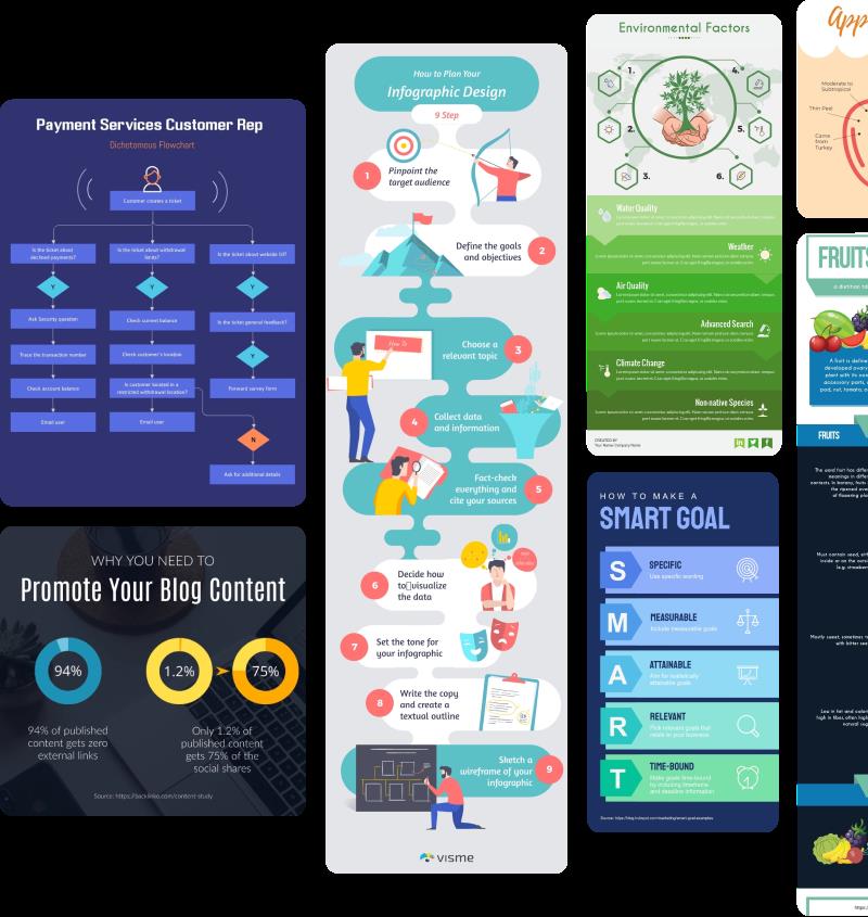
Dive into the world of infographic design with our comprehensive guide, exploring the top 10 fundamental tips.
This article elucidates the critical role of color theory and balance in creating compelling, impactful infographics.
With an in-depth focus on design principles, we provide innovative insights into color palettes, contrast, harmony, and more.
Avoid common pitfalls and discover the power of effective color application through our curated case studies.
Unleash your creativity and enhance your design knowledge with us.
Understanding the Basics of Color Theory
Beginning with the understanding of color theory is crucial in harnessing its power effectively in infographic design. This knowledge paves the way for designers to manipulate color associations and chromatic symbolism to craft visually stimulating and informative graphics.
Color associations refer to the psychological responses evoked by specific hues, which can significantly influence the perception and reception of an infographic.
Chromatic symbolism, on the other hand, pertains to the cultural, societal, and personal meanings attributed to colors.
By integrating these elements into the design process, designers can create infographics that not only capture attention, but also resonate with the viewer on a deeper level.
This innovative approach to design serves as a testament to the transformative power of color theory.
Using Color Theory in Infographics
Undoubtedly, the proper application of color theory in infographics can dramatically enhance their aesthetic appeal and effectiveness, but it requires a deep understanding and skilful manipulation of hues and their associated meanings. To maximize the impact of your design, consider color associations and their cultural implications.
Red, for instance, can signify passion or danger, while blue often connotes trust and tranquility. Strategically using these associations can guide viewer attention, emphasizing important data points and facilitating comprehension.
Furthermore, to ensure infographic accessibility, consider contrast and color blindness. High contrast between text and background improves legibility, while incorporating patterns or symbols alongside color can make infographics accessible to color-blind individuals.
Thus, thoughtful color usage can transform your infographic from merely informative to truly compelling.
The Importance of Choosing the Right Color Palette
The color palette you choose for your infographic can have a profound impact, not only on its aesthetics, but also on its effectiveness in conveying information.
The right combination of hues can guide the viewer's eye, emphasize key points, and evoke specific emotional responses.
Understanding the principles of color theory is fundamental, yet the art lies in applying this knowledge to select a palette that enhances the message and resonates with the target audience.
Color Palette Selection
In the realm of infographic design, settling on the right color palette is integral to the process of creating an effective, visually appealing, and balanced composition. Palette versatility and cultural considerations are key factors to bear in mind during this selection process.
A versatile palette allows for adaptability, a significant advantage when aiming to captivate diverse audiences. It enables the designer to create harmony and visual interest, whilst maintaining consistency and coherence.
Cultural considerations, on the other hand, warrant a more nuanced approach to color selection. Colors carry different connotations across cultures, influencing perceptions and interpretations. Therefore, it's crucial to comprehend and respect these cultural color meanings to ensure your infographic resonates with its intended audience and doesn't inadvertently offend.
Impact on Audience
A staggering 90% of snap judgments made about products can be based on color alone, emphasizing the critical importance of selecting the appropriate color palette when designing an infographic.
This underscores the role of color in audience engagement - striking the right tone can lead to increased interaction and resonance with your content.
The color scheme you choose doesn't just affect aesthetics; it can also influence the emotional response and perception of your brand. Therefore, demographic targeting is essential when selecting your palette, considering factors such as cultural associations, age, gender, and personal preferences.
How to Achieve Balance in Infographic Design
Achieving balance in infographic design is a nuanced process that involves a deep understanding of visual weight, the dichotomy between symmetry and asymmetry, and the strategic use of negative space.
The concept of visual weight, which is the perceived heaviness or lightness of the elements in a design, plays a pivotal role in creating a balanced composition.
Meanwhile, the choice between symmetry and asymmetry can significantly impact the overall harmony of the design.
Just as effectively utilizing negative space can enhance readability and focus.
Understanding Visual Weight
Mastering the concept of visual weight is fundamental to creating balance and harmony in infographic design. Visual perception of graphic elements carries a certain weight that impacts the overall design balance.

Size: Larger elements carry more visual weight. Use this to direct focus on key information.
Color: Bold, intense colors can add weight to a graphic element, making it stand out.
Position: Elements located centrally or at eye level are perceived as heavier.
Texture: Dense, complex textures can increase an element's visual weight.
Understanding these factors allows for a more thoughtful, innovative approach to design. By manipulating these variables, one can control the viewer's eye movement, create emphasis, and achieve a balanced, harmonious infographic design.
Symmetry Vs Asymmetry
In the realm of infographic design, the strategic use of symmetry and asymmetry plays a pivotal role in maintaining visual balance and directing viewer attention.
Symmetrical simplicity is a classic approach, providing a sense of harmony and elegance. It's a tool that can be leveraged to create immediate recognition, like mirroring halves of a chart to illustrate comparison.
On the other hand, the asymmetrical advantages are boundless. Used judiciously, it can bring dynamism, add interest, and guide the viewer's eye through a data story. It invokes a sense of movement, breaking the monotony, and adding a layer of sophistication.
The key is to strike a balance between the two, using symmetry for stability and asymmetry for energy, thereby crafting a compelling visual narrative.
Utilizing Negative Space
To effectively bring out the elements in your infographic design, you should skillfully carve out the negative space, which can provide balance and enhance the overall visual impact. This minimalist design approach, often used in negative space typography, allows viewers to focus on the main elements, thereby creating a smooth user experience.
Consider these four principles to successfully utilize negative space:
- Embrace Simplicity: Avoid overloading your design with excessive visuals or texts.
- Break up text: Use negative space to improve readability and comprehension.
- Highlight key elements: Negative space can be used to bring attention to specific data or information.
- Create a flow: Negative space can guide the viewer's eyes across the infographic in a structured manner.
Innovation in design isn't about adding more, but achieving balance by wisely using less.
The Role of Contrast in Infographics
While the use of color attracts attention in infographics, it is through effective contrast that designers can emphasize and highlight key information. Expert contrast application allows key elements to stand out, making them easily discernible and meaningful. Conversely, contrast missteps can lead to visual confusion or information being overshadowed.
Contrast in infographics isn't just about color differences; it also encompasses size, shape, and position. A large, bold headline contrasts with smaller text, drawing the eye. Similarly, an isolated icon garners more attention than one within a cluster.
The innovative use of contrast is a powerful tool for guiding viewers through an infographic, ensuring they absorb the most important data first. Proper application of contrast fosters clarity, depth, and focus, making your infographic more effective and engaging.
Exploring the Effects of Color on Emotion
Understanding the emotional impact of color is fundamental to effective infographic design. Color psychology, the study of how hues influence human behavior, plays a crucial role in shaping the viewer's emotional responses.
Therefore, by strategically selecting the right color palette, designers can not only enhance the visual appeal of an infographic but also subtly influence the viewer's emotions and perceptions.
Color and Emotional Response
Exploring the intricate relationship between color and emotional response allows us to comprehend how different hues can impact our feelings and perceptions. This understanding is crucial in creating innovative designs that evoke the desired emotional hue interpretation and color-induced moods.
Red: Often associated with energy, passion, and urgency, thus can trigger excitement or alertness.
Blue: Typically evokes feelings of calm and trust, making it ideal for branding and communication.
Yellow: Conveys happiness and creativity, but too much can cause anxiety.
Green: Symbolizes nature and peace, inducing tranquility and promoting relaxation.
Balancing these colors in design, while understanding their emotional impact, can foster the desired audience engagement and response.
Color Psychology in Design
In the realm of design, the use of color is not merely a matter of aesthetics, but also a powerful tool in influencing human emotions and behaviors. Delving into color psychology, designers manipulate hues to evoke specific responses.
Color symbolism in design is pivotal; red can convey energy or danger, blue elicits calm or sadness, and yellow can suggest happiness or caution. However, color impact isn't universal. Cultural interpretations of color play a significant role. For instance, while white symbolizes purity in Western cultures, it's often associated with mourning in Eastern cultures. Therefore, understanding your audience's cultural background is essential.
Through the strategic application of color theory, designers can guide emotional responses, effectively communicate messages, and foster user engagement.
The Power of Color Harmony in Infographics
Through the lens of color harmony, we can elevate the visual impact and effectiveness of infographics. Color evolution and the strategic application of colors play a pivotal role in infographic branding. It is not just about aesthetically pleasing designs, but also about creating a connection with the audience.
Monochromatic Harmony: Using different tints, shades, and tones of a single color establishes a subtle and cohesive look.
Analogous Harmony: Colors adjacent to each other on the color wheel create a serene and comfortable design.
Complementary Harmony: Using colors opposite each other on the color wheel adds a vibrant touch to infographics.
Triadic Harmony: Three colors equally spaced on the color wheel provide a balanced yet stimulating visual experience.
Understanding and leveraging the power of color harmony can unlock new dimensions in infographic design.
Mastering the art of color coding can significantly enhance the clarity and visual appeal of your infographics, aiding in effectively highlighting key pieces of information.
It is essential to understand the nuanced language of color symbolism and the cultural perceptions associated with different colors. For instance, reds often denote urgency or importance, blues inspire trust, and greens signify growth or stability. However, these may vary across cultures.
To innovate, experiment with contrasting shades to draw attention to specific data points or utilize a monochromatic scheme for a harmonious, balanced visual.
How to Avoid Common Color Mistakes in Infographics
Avoiding common color mistakes in infographics requires a keen understanding of color theory and its application in visual communications. To ensure optimal infographic aesthetics, consider these color blunders:
Overuse of Colors: Limit your palette to 2-3 primary colors and their variations. Too many colors can confuse the viewer and dilute the message.
Lack of Contrast: High contrast is essential for readability. Dark text on a dark background or vice versa is a common mistake.
Ignoring Color Psychology: Colors evoke emotions. Choose colors that align with the message and desired emotional response.
Inconsistent Color Schemes: Maintain a consistent color scheme throughout the infographic for a cohesive look.
Case Studies: Successful Infographics and Their Color Schemes
We've explored the theory, and now let's delve into practical examples of successful infographics and their color schemes, observing how they apply color theory to achieve balance and aesthetic appeal.
An excellent example is Spotify's 'Year in Music' infographic, which uses a cool, monochromatic blue palette. This choice of color not only complements Spotify's brand representation but also enhances the infographic typography, making it legible and aesthetically pleasing.
Another case is the 'Cost of Living' infographic by MoveHub, which employs a vibrant, complementary color scheme to distinguish between different countries. The contrasting colors create visual balance, making the information easily digestible.
These cases demonstrate the innovative application of color theory in infographic design, creating compelling visuals that effectively convey information.
Frequently Asked Questions
What Are Some Examples of Popular Infographic Software to Use for Design?
Popular infographic software includes Canva, Piktochart, and Venngage, each offering unique software features. Canva is user-friendly, Piktochart offers a robust toolset, while Venngage provides a balance of simplicity and advanced design features.
How Long Does It Typically Take to Design an Infographic?
The design timeline for an infographic varies significantly, as it's dependent on complexity and the designer's expertise. For efficiency, a simple infographic may take a few hours, while intricate designs may require several days.
Can You Provide Examples of Infographics That Were Not Successful Due to Poor Color Choice?
Certainly, poor color selection can undermine infographic success. Examples include instances where colors do not align with Color Psychology in Infographics, or where Mistakes in Infographic Color Selection disrupt visual hierarchy or obscure data.
Are There Specific Industries or Topics That Benefit More From Using Infographics?
Yes, infographics are particularly beneficial in education and marketing sectors. In education, infographics simplify complex information, aiding comprehension. In marketing, they visually represent data, enhancing consumer engagement and facilitating better understanding of products or services.
Infographics are effective in both print and digital formats. However, print limitations such as size and color availability can pose challenges. Digitally, advantages include interactive elements and limitless scaling, enhancing visual communication.

 Digital Art InstructionDIY Infographics DesignMobile Game ArtworkPersonalized Logo Design3D AnimationeBook Covers DesignPrivacy PolicyTerms And Conditions