
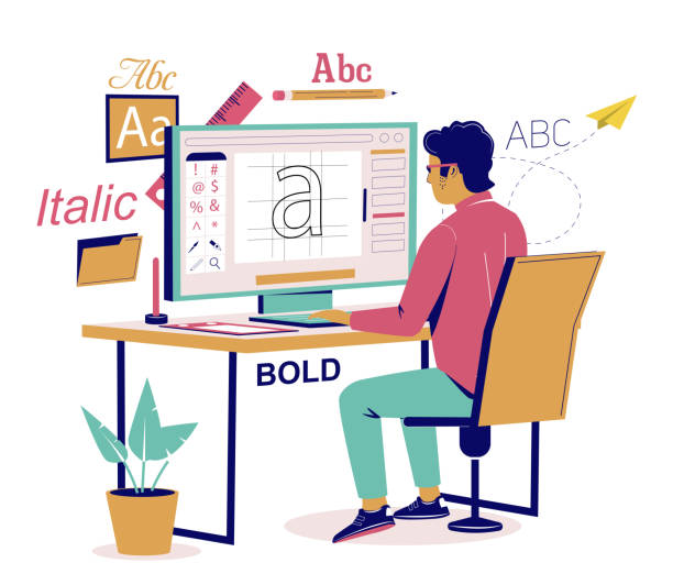
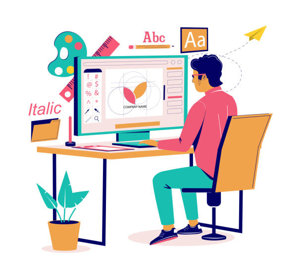
In the world of ebook cover design, typography plays an essential role in capturing the attention of potential readers and conveying the essence of a book.
This article explores ten fundamental lessons in the art of ebook cover typography, covering topics such as font selection, font pairing, line height, and spacing.
By understanding these principles, authors and designers can create visually compelling covers that not only engage readers but also reflect the genre and convey the intended emotions.
The Importance of Font Selection
In the realm of ebook cover typography, the importance of font selection cannot be overstated. Font selection plays a crucial role in capturing the attention of potential readers and conveying the desired message or mood of the book.
The psychology of font selection is rooted in the understanding that different fonts evoke different emotions and associations. For example, a bold and edgy font may be appropriate for a thriller novel, while a delicate and elegant font may be more suitable for a romance novel.
Furthermore, font selection also has a significant impact on branding. Consistent use of fonts across different marketing materials, including ebook covers, helps to establish a cohesive and recognizable brand identity. This consistency builds trust and familiarity with the audience, ultimately leading to increased recognition and sales.
Understanding Font Pairing Techniques
When considering font pairing techniques, it is important to understand the dynamic interplay between different fonts and how they can enhance the visual impact of ebook covers.
Font pairing involves selecting two or more fonts that complement each other and create a harmonious balance. The goal is to achieve a cohesive and visually appealing design that reflects the branding of the ebook.
There are several techniques that can be used to achieve effective font pairing. One technique is to pair contrasting fonts, such as a bold and a delicate font, to create visual interest and emphasize important elements of the cover.
Another technique is to pair fonts from the same family or with similar characteristics, which can create a sense of consistency and coherence.
Ultimately, font pairing is a creative process that requires experimentation and a keen eye for design. By carefully selecting fonts that complement each other, ebook covers can effectively communicate the desired branding and capture the attention of potential readers.
Mastering Line Height for Ebook Covers
Achieving optimal line height for ebook covers requires a careful balance between readability and aesthetic appeal. Line height refers to the vertical spacing between lines of text, and it plays a crucial role in determining how easily readers can absorb the content.
To optimize readability, consider the following line height techniques:
Use a generous line height: Avoid cramming text together by increasing the space between lines. This improves legibility and prevents readers from feeling overwhelmed.
Maintain consistency: Use the same line height throughout the ebook cover to create a cohesive and professional look.
Consider the font size: Adjust the line height accordingly based on the font size to ensure the text is well-spaced and easy to read.
Test and iterate: Experiment with different line heights and solicit feedback to find the perfect balance between readability and aesthetics.
The Impact of Proper Spacing in Typography
Additionally, proper spacing in typography can significantly enhance the readability and aesthetic appeal of ebook covers. The role of whitespace in typography cannot be overstated.
Whitespace refers to the empty space between different elements of a design, such as letters, words, and lines. It allows the reader's eyes to rest and helps guide their focus. Achieving balance with spacing is crucial in creating a harmonious and visually pleasing composition.
Too much space can make the text feel disconnected and disjointed, while too little space can make it difficult to read. The right amount of spacing ensures that the text is easy to read and understand, while also creating a sense of elegance and professionalism.
Designers must carefully consider the spacing between letters, words, and lines to create a balanced and visually appealing ebook cover.
How to Choose Fonts That Reflect the Book's Genre
One must carefully select fonts that reflect the book's genre in order to create a visually cohesive and appealing ebook cover. Choosing the right fonts for branding is crucial as it sets the tone and communicates the book's content to potential readers. Typography has the power to evoke emotions and create a strong connection with the audience.
When selecting fonts that reflect the book's genre, consider the following:
- Research the genre: Understand the characteristics and themes associated with the book's genre.
- Look for fonts that align with the genre's style and mood.
- Consider fonts that are commonly used in books of the same genre.
Consider the target audience:
- Reflect the preferences and expectations of the intended readers.
- Use fonts that resonate with the target audience's taste and preferences.
- Avoid fonts that may alienate or confuse the readers.
Exploring Serif and Sans Serif Fonts for Ebook Covers
When designing ebook covers, designers should carefully consider the use of serif and sans serif fonts to create visually appealing and engaging designs.
Serif fonts, with their decorative strokes at the ends of letters, are often associated with traditional and formal styles. This makes them suitable for genres such as historical fiction or romance.
On the other hand, sans serif fonts, with their clean and modern appearance, are often used for contemporary and minimalist designs. They work well for genres like science fiction or self-help books.
When choosing font pairings for ebook covers, it is important to consider the overall aesthetic and mood of the book. Combining a serif and a sans serif font can create an interesting contrast and add depth to the design. Some popular font pairings for ebook covers include pairing a bold sans serif font with a delicate serif font, or mixing different weights of the same font family.

Ultimately, the choice of serif or sans serif fonts for ebook cover typography depends on the genre, theme, and target audience of the book. Designers should carefully consider these factors to create visually captivating and cohesive designs.
Creating Visual Hierarchy With Font Styles
When it comes to ebook cover typography, creating visual hierarchy with font styles is crucial for capturing the attention of potential readers.
Font style hierarchy helps guide the viewer's eye, allowing them to quickly identify and understand the most important elements of the cover.
Font Style Hierarchy
As we delve into the concept of font style hierarchy, it becomes evident that creating visual hierarchy with font styles is crucial in effectively conveying information in ebook cover typography. Font style hierarchy refers to the arrangement and prioritization of different font styles to guide the reader's eye and emphasize important elements.
By understanding the principles of font styling, designers can create a visually appealing and engaging cover that captures the attention of potential readers. Here are two important aspects of font style hierarchy:
Font Weight: Utilizing different weights, such as bold or light, can add emphasis and create contrast between different levels of information.
Font Size: Varying the size of fonts can help establish hierarchy, with larger fonts drawing attention to headlines or titles, and smaller fonts used for secondary text or captions.

Importance of Visual Hierarchy
To effectively convey information in ebook cover typography, it is essential to understand the importance of visual hierarchy and how it can be created through font styles.
Visual hierarchy refers to the arrangement and organization of text elements in a way that guides the reader's attention and emphasizes certain information over others.
Exploring font hierarchy techniques is crucial in creating a well-designed ebook cover that captures the reader's interest.
One way to create visual hierarchy is through font size and weight. By using larger and bolder fonts for headlines or important information, and smaller and lighter fonts for secondary details, emphasis can be effectively achieved.
This contrast in font size and weight helps guide the reader's eye and directs their attention to the most important elements on the cover.
Enhancing Readability Through Styling
The use of different font styles is a key element in enhancing readability and creating a visual hierarchy in ebook cover typography. By carefully selecting and styling fonts, designers can improve the legibility of text and ensure that important information stands out.
Here are some tips for enhancing readability through styling:

Font Styles: Experiment with different font styles, such as bold, italic, and underline, to emphasize important words or phrases.
Color Contrast: Utilize color contrast to enhance readability. For example, pairing a dark-colored font with a light-colored background can make the text pop and be easier to read.
Balancing Typography With Imagery on Ebook Covers
In order to create visually appealing ebook covers, it is important to find a balance between typography and imagery. By harmonizing the text and images, designers can create a cover that effectively communicates the essence of the book.
Additionally, visual hierarchy plays a crucial role in guiding the viewer's attention and ensuring that the typography and imagery work together seamlessly. Achieving this balance requires careful consideration of font styles, sizes, and placement, as well as the overall composition of the cover.
Harmonizing Text and Images
Achieving a seamless integration between typography and imagery on ebook covers is crucially important for capturing the attention and interest of potential readers. When it comes to harmonizing text and images, there are several key factors to consider.
Here are two subtopics that will help you balance text and visuals effectively:
Choosing the right image: Selecting a visually appealing and relevant image is essential. The image should complement the text and create a cohesive and visually pleasing composition.

Typography placement: Properly placing the text on the cover is vital for achieving text-image synergy. Consider the size, color, and style of the font, as well as the placement and hierarchy of the text elements. Ensure that the text does not overpower the image or get lost in the background.
Visual Hierarchy and Balance
Effectively balancing typography with imagery on ebook covers requires careful attention to visual hierarchy and a harmonious composition. Visual hierarchy techniques play a crucial role in achieving balance in design by guiding the viewer's eye and emphasizing important elements.
One technique is to use contrasting font sizes and weights to create a focal point for the title or key information. Placing the title at the top or center of the cover can also help establish hierarchy.
Additionally, incorporating imagery that complements the typography can enhance the overall balance. For example, using images that align with the theme or genre of the book can create a cohesive and visually appealing cover.
Tips for Enhancing Readability With Font Size
To optimize the legibility of ebook covers, careful consideration of font size is essential for enhancing reader comprehension and engagement. The right font size can make a significant difference in readability, ensuring that the text is clear and easy to read across various devices. Here are some tips for enhancing readability through font size:
Choose an appropriate font size: Experiment with different sizes to find the one that offers maximum readability without compromising aesthetics.
Consider the device: Optimize font size for different devices, such as e-readers, tablets, and smartphones. Test how the font size appears on each device to ensure it is easily readable.

For e-readers: Use a slightly larger font size due to the smaller screen size.
For tablets and smartphones: Consider the screen resolution and adjust the font size accordingly.
Harnessing the Power of Typography to Convey Emotion
Both font selection and typography techniques play a crucial role in effectively conveying emotion on ebook covers.
Conveying emotions through font selection involves choosing fonts that evoke a specific mood or feeling. For example, a bold, heavy font may convey strength and power, while a delicate, flowing font may evoke a sense of elegance and romance.
Utilizing typographic hierarchy is another important technique for conveying emotion. By varying the size, weight, and placement of different elements, such as the title, author name, and subtitle, you can create a visual hierarchy that guides the viewer's attention and conveys the intended emotion.
For example, a large, bold title with a contrasting color can create a strong impact, while a smaller, lighter font for the author name can add a touch of subtlety.
Frequently Asked Questions
What Are Some Common Mistakes to Avoid When Selecting Fonts for Ebook Covers?
When selecting fonts for ebook covers, it is important to prioritize font legibility to ensure readability. Additionally, creating a cohesive and visually appealing font combination can be achieved by considering factors such as font styles, sizes, and weights.

How Can I Determine the Appropriate Line Height for My Ebook Cover Typography?
Determining the appropriate line height for ebook cover typography involves considering factors such as legibility, readability, and aesthetic appeal. Best practices for font pairing should also be taken into account to ensure a cohesive and visually pleasing design.
Are There Any Specific Spacing Guidelines I Should Follow When Designing Ebook Covers?
When designing ebook covers, it is important to follow specific spacing guidelines for optimal readability and visual appeal. Additionally, selecting appropriate fonts plays a crucial role in creating a professional and engaging cover design.
Can You Provide Some Examples of Fonts That Work Well for Different Book Genres?
The impact of font selection on reader perception in different book genres is significant. Font pairing is crucial for conveying the right tone and style in ebook covers. Here are some examples of fonts that work well for different genres.
What Are Some Techniques for Creating a Visually Balanced Composition With Typography and Imagery on Ebook Covers?
To achieve a visually balanced composition on ebook covers, techniques for harmony between typography and imagery are essential. Effective use of typography can enhance the visual appeal, and tips can assist in creating an appealing design.
 Digital Art InstructionDIY Infographics DesignMobile Game ArtworkPersonalized Logo Design3D AnimationeBook Covers DesignPrivacy PolicyTerms And Conditions