
In the ever-evolving world of digital publishing, the design of an ebook cover plays a crucial role in capturing the attention of potential readers. This article delves into the realm of ebook cover design, exploring ten game-changing elements that can make a significant impact.
From understanding the importance of genre and target demographics to incorporating eye-catching visuals and utilizing color psychology, discover how these elements can elevate your ebook cover design and attract your desired audience.
Get ready to revolutionize your ebook covers!
The Importance of Genre in Ebook Cover Design
One of the most crucial factors to consider in ebook cover design is the genre, as it plays a significant role in attracting the target readership. The role of genre in ebook cover design cannot be underestimated, as it sets the tone and expectations for readers.
Different genres have distinct visual cues that can help identify and attract specific audiences. For example, a romance novel cover may feature a passionate embrace, while a thriller cover may showcase a mysterious figure or a suspenseful scene.
Understanding Target Demographics for Effective Ebook Covers
To effectively design ebook covers, it is crucial to understand the target demographics and their preferences. Understanding target demographics for effective ebook covers involves designing for different age groups and considering cultural influences in cover design. Here are three key points to keep in mind:
Age Group: Different age groups have different preferences when it comes to ebook covers. For example, younger readers may be drawn to bold and vibrant designs, while older readers may prefer more sophisticated and subtle designs.

Cultural Influences: Cultural influences play a significant role in cover design. It is important to consider the cultural background of the target audience and incorporate elements that resonate with them. This could include symbols, colors, or imagery that are culturally significant.
Preferences and Trends: Understanding the preferences and trends within the target demographics is crucial for creating effective ebook covers. Researching popular books within the genre and analyzing their cover designs can provide insights into what appeals to the target audience.
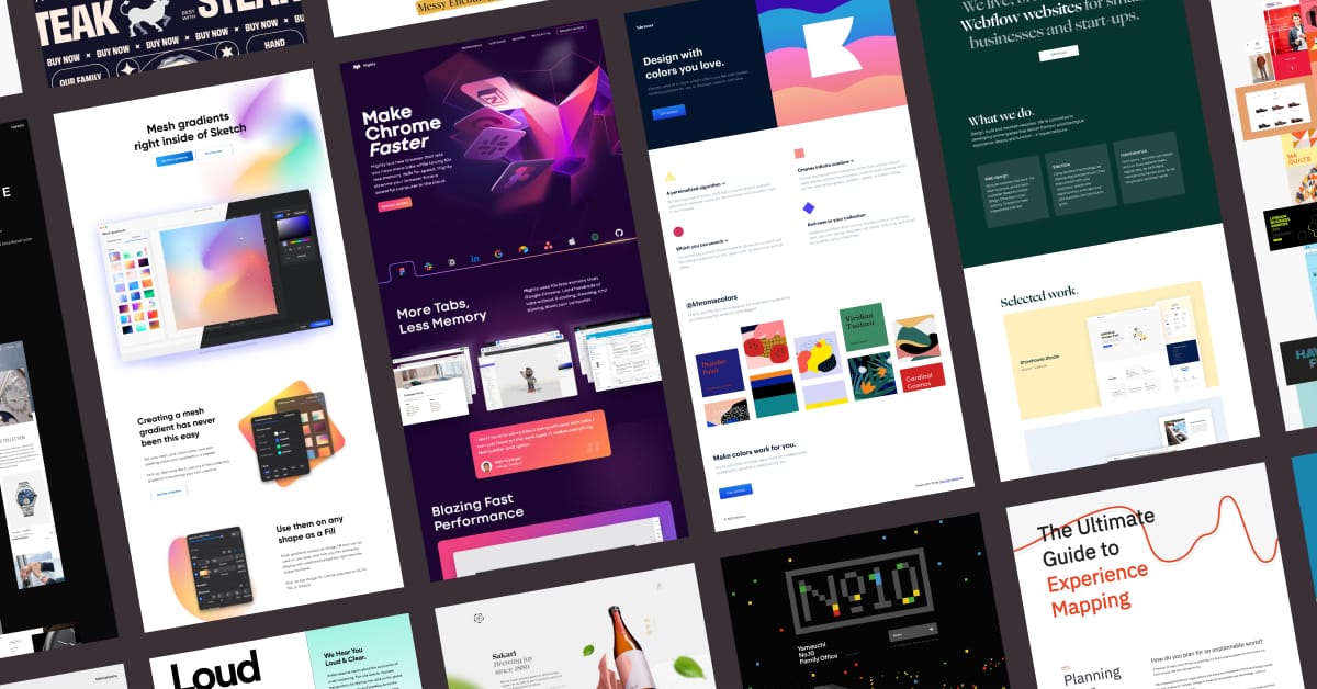
Eye-Catching Visuals: A Key Element in Ebook Cover Design
Eye-catching visuals are a crucial component in ebook cover design, capturing the attention of potential readers and enticing them to explore further. Captivating illustrations and a creative composition are essential in creating a visually engaging cover that stands out in a sea of digital books.
With the freedom to experiment and push boundaries, designers can create unique and captivating visuals that reflect the essence of the story within. A well-designed ebook cover not only attracts readers but also conveys the genre and tone of the book, giving potential readers a glimpse into the world they are about to enter.
Typography: The Art of Choosing the Right Fonts for Ebook Covers
Selecting the appropriate fonts for ebook covers is a critical aspect of typography, as it sets the tone and enhances the overall design. Fonts have the power to evoke emotions, convey messages, and capture the essence of a book.
When choosing fonts for ebook covers, consider the following:
Font Pairing: Combining different fonts can create a visually appealing and harmonious composition. Experiment with contrasting styles, such as pairing a bold, sans-serif font with a delicate serif font, to create a captivating effect.

Font Psychology: Fonts have psychological associations that can influence how readers perceive a book. For example, serif fonts are often associated with tradition and elegance, while sans-serif fonts convey a modern and clean aesthetic. Choose fonts that align with the genre and mood of your ebook to resonate with your target audience.
Legibility: While creativity is key, it's important to prioritize legibility. Avoid overly decorative or complex fonts that may be difficult to read, especially in thumbnail versions. Opt for fonts that are clear, well-spaced, and easy on the eyes to ensure a positive reading experience.
Color Psychology: Using Colors to Convey Emotions in Ebook Covers
Using color theory to evoke specific emotions in ebook covers is a powerful tool in the psychology of color in ebook cover design. Different colors have the ability to elicit specific emotions and create a visual impact that resonates with readers.
For example, warm colors like red and orange can evoke feelings of excitement and passion, while cool colors like blue and green can create a sense of calmness and tranquility.
By strategically selecting and combining colors, ebook cover designers can enhance the overall mood and tone of the book, capturing the attention of potential readers and enticing them to explore further.
Understanding the psychology of color allows designers to tap into the subconscious desires and emotions of readers, making their ebook covers more visually engaging and captivating.
Balancing Simplicity and Complexity in Ebook Cover Design
When it comes to ebook cover design, finding the right balance between simplicity and complexity is crucial.

On one hand, a visually impactful design can grab the attention of potential readers, but if it sacrifices readability, it may fail to convey important information about the book.
On the other hand, a minimalist design can be clean and elegant, but it runs the risk of appearing too generic or uninteresting.
Striking the perfect balance between these two elements is key to creating a compelling and effective ebook cover.
Visual Impact Vs Readability
Achieving the perfect equilibrium between visual impact and readability is crucial when striking a balance between simplicity and complexity in ebook cover design. The design should be visually captivating, drawing the reader's attention, while also ensuring that the text is easily readable.
Here are three factors to consider when finding the right balance in ebook cover design:
Font choice: Selecting a font that is both visually appealing and easily legible is essential. Experiment with different fonts to find the perfect combination of style and readability.
Color palette: The colors used in the design should complement each other and create a visually striking cover. However, be mindful of the contrast between the text and background to ensure readability.

Composition: The placement and arrangement of elements on the cover should create a visually pleasing and balanced design. Avoid clutter and aim for simplicity, allowing the main message of the cover to shine through.
Minimalism or Detailed Designs
Finding the right balance between minimalism and detailed designs is essential in ebook cover design. It requires carefully considering the complexity of the design while maintaining simplicity.
When it comes to ebook covers, both minimalism and detailed designs have their pros and cons. Abstract designs, for example, can be visually striking and capture the attention of potential readers. They can evoke curiosity and intrigue, drawing readers in to explore further. However, abstract designs can also be ambiguous and may not effectively convey the genre or theme of the book.
On the other hand, detailed designs can provide more context and information about the book, helping readers understand what the story is about. However, too much detail can be overwhelming and may distract from the main message of the cover.
Similarly, color choice plays a significant role in reader engagement. Bright and vibrant colors can attract attention and create a sense of excitement, while muted and subdued colors can convey a more serious or somber tone.
Ultimately, the choice between minimalism and detailed designs, as well as color selection, should be based on the genre, target audience, and overall message of the book.
Incorporating Unique and Memorable Symbols in Ebook Covers
Integrating distinctive and unforgettable symbols into ebook covers enhances their visual appeal and captivates readers. Symbols have the power to convey deep meaning and evoke emotions, making them an effective tool in cover design.

Here are three ways in which incorporating unique and memorable symbols can elevate ebook covers:
Symbolic Representation: Symbols can represent abstract ideas or concepts, allowing readers to connect with the themes and messages of the book on a deeper level. Whether it's a butterfly symbolizing transformation or a key symbolizing unlocking mysteries, these symbols add depth and intrigue to the cover.
Cultural References: Including symbols that hold cultural significance can resonate with readers from specific backgrounds or pique the curiosity of those interested in exploring different cultures. From ancient symbols like the yin and yang to modern symbols like the peace sign, cultural references can spark interest and create a sense of inclusivity.
Visual Impact: Memorable symbols have the power to create a strong visual impact, capturing the attention of potential readers and enticing them to explore further. A striking symbol can make an ebook cover stand out in a crowded marketplace, making it more likely to be noticed and chosen.
Creating a Strong Visual Hierarchy in Ebook Cover Design
A strong visual hierarchy in ebook cover design ensures that key elements are prioritized and organized effectively, guiding the viewer's attention and enhancing the overall impact of the cover. By strategically arranging design elements, such as typography, color, and imagery, designers can create a cover that not only grabs attention but also elicits an emotional connection with the audience.
One way to create a strong visual hierarchy is by incorporating cultural references in ebook cover design. Cultural references can be used to instantly convey the genre or theme of the book and resonate with the target audience. For example, using symbols or imagery that are associated with a specific culture can evoke a sense of familiarity and intrigue, making the viewer more likely to engage with the book.
The Power of Contrast and Negative Space in Ebook Covers
Through the strategic use of contrast and negative space, ebook covers can captivate audiences and convey a powerful visual message. The power of negative space in ebook covers lies in its ability to create a sense of balance and simplicity, allowing the main elements to stand out and grab attention.

Creating visual contrast in ebook cover design is essential for grabbing the audience's attention and making the cover visually appealing. Here are three ways in which the power of negative space and contrast can enhance ebook covers:
Emphasizing the focal point: By using negative space to create a contrast between the background and the main elements, the focal point of the cover can be highlighted, drawing the viewer's eye towards it.
Conveying a mood or theme: Negative space can be used to create symbolism and evoke certain emotions or themes, adding depth and meaning to the cover design.
Enhancing readability: By using contrast between the text and the background, negative space can improve the legibility of the title and author's name, making it easier for potential readers to identify and remember the book.
Testing and Iterating: The Continuous Improvement of Ebook Covers
Continuously improving ebook covers is crucial in capturing the attention of readers and boosting sales. Design experimentation allows designers to explore different approaches and find what works best for their target audience.
Gathering user feedback is essential to understand what elements resonate with readers, enabling an iterative approach that refines and enhances the cover design over time.
Design Experimentation Benefits
With design experimentation, ebook cover designers can continuously refine and enhance their creations to ensure maximum impact and appeal to their target audience. This process of testing and iterating allows designers to push the boundaries of design innovation and engage in creative exploration.
By trying out different concepts, colors, typography, and imagery, designers can uncover unique and visually stunning ideas that captivate readers and convey the essence of the book.
Design experimentation also enables designers to gather valuable feedback from readers and iterate on their designs based on their preferences and reactions. This continuous improvement process ensures that ebook covers evolve with the changing tastes and preferences of the target audience, resulting in covers that are not only visually appealing but also highly effective in grabbing attention and generating interest.
User Feedback Importance
To ensure the continuous improvement of ebook covers, designers must actively seek user feedback and iterate accordingly.
User feedback implementation is a crucial step in the design process as it allows designers to understand how their covers are perceived by their target audience.
By measuring user satisfaction, designers can identify areas for improvement and make necessary adjustments to enhance the overall appeal and effectiveness of their covers.
This iterative approach not only ensures that ebook covers meet the preferences and expectations of readers but also increases the chances of attracting potential buyers.
Engaging with users and incorporating their feedback not only enhances the design process but also builds a sense of ownership and connection with the audience, leading to more successful and visually captivating ebook covers.

Iterative Approach Advantages
Employing an iterative approach in ebook cover design offers numerous advantages. This continuous improvement process brings several benefits of design experimentation, ensuring that the final cover resonates with the target audience and effectively communicates the essence of the book.
Some advantages of this approach include:
Flexibility: Iterative design allows for flexibility and adaptability, enabling designers to make changes and adjustments as needed throughout the process.
Enhanced user experience: By incorporating user feedback and testing, designers can create covers that not only capture attention but also appeal to the specific preferences and expectations of the target audience.
Increased conversion rates: Continuous improvement through iterative design can lead to higher conversion rates, as the refined covers are more likely to attract potential readers and entice them to click on the ebook.
Frequently Asked Questions
How Can I Determine the Genre of My Ebook Cover Design?
To determine the genre of your ebook cover design, conduct thorough research on the visual elements commonly associated with different genres. Analyze book covers in your chosen genre and identify key design features that convey the genre effectively.
What Factors Should I Consider When Identifying My Target Demographic for Ebook Covers?
When identifying the target demographic for ebook covers, it is crucial to conduct market research to understand the audience's preferences and interests. Additionally, the impact of imagery and visuals cannot be underestimated in attracting the desired target audience.
Are There Any Specific Fonts That Work Best for Ebook Covers?
When choosing fonts for ebook covers, it is important to avoid overused or outdated options. Instead, opt for fonts that align with your genre and target demographic. Consider factors like readability, legibility, and visual appeal to make the right choice.
How Can I Effectively Use Colors to Evoke Emotions in My Ebook Cover Design?
Using color psychology in ebook cover design is crucial for evoking emotions. Colors like red can create a sense of urgency, while blue can evoke calmness. Typography also plays a vital role in conveying emotions effectively.
What Are Some Strategies for Testing and Improving the Effectiveness of Ebook Covers?
To test and improve ebook cover effectiveness, consider A/B testing different designs to see which resonates best with your target audience. Additionally, eye tracking studies can provide valuable insights into how readers visually engage with your cover.
 Digital Art InstructionDIY Infographics DesignMobile Game ArtworkPersonalized Logo Design3D AnimationeBook Covers DesignPrivacy PolicyTerms And Conditions