
In today's digital age, it is crucial for authors and publishers to effectively incorporate branding into ebook cover designs. By doing so, they can create a visually appealing and cohesive representation of their brand, enticing potential readers and setting their work apart from the competition.
In this article, we will explore eight successful techniques that professionals can utilize to seamlessly integrate branding elements into ebook cover designs, ultimately elevating their marketing efforts and maximizing the impact of their work.
Choosing the Right Colors and Typography
The selection of appropriate colors and typography plays a crucial role in effectively incorporating branding into ebook cover design. When it comes to choosing the right color scheme, it is important to consider the emotions and associations that different colors evoke.
For example, using bold and vibrant colors can create a sense of excitement and energy, while softer and more muted tones can convey a feeling of calmness and tranquility.
Additionally, it is essential to prioritize readability and legibility when selecting typography for the ebook cover. The chosen font should be easily readable at different sizes and styles, ensuring that the title and author's name are clear and easy to understand.
Creating a Consistent Visual Theme
Creating a consistent visual theme is essential in ebook cover design as it helps establish a strong brand identity. One of the key aspects of achieving this consistency is through color palette selection. By carefully choosing colors that align with the brand's identity and evoke the desired emotions, designers can create a cohesive look and feel across all ebook covers.
Additionally, typography and font choice play a crucial role in maintaining visual consistency. Using fonts that reflect the brand's personality and are easily readable can enhance the overall aesthetic and make the covers more appealing to the target audience.

Color Palette Selection
Color palette selection plays a crucial role in establishing a consistent visual theme for ebook cover designs. The colors used in a design have the power to evoke emotions and create a connection with the audience. This is where color psychology comes into play.
Different colors have different meanings and can evoke different feelings. For example, warm colors like red and orange can create a sense of excitement and energy, while cool colors like blue and green can evoke a feeling of calmness and tranquility.
When selecting a color palette for your ebook cover design, it is important to consider your brand's identity and values. The colors should align with your brand's personality and evoke the desired emotions in your target audience.
Typography and Font Choice
An appropriate choice of typography and font can greatly contribute to the creation of a consistent visual theme in ebook cover design. Typography trends are constantly evolving, and staying up to date with the latest styles can help your ebook cover stand out.
Bold and modern fonts are currently popular, as they convey a sense of confidence and professionalism. On the other hand, vintage and hand-drawn fonts can add a touch of nostalgia or playfulness to your design.
It is important to consider font psychology when making your choice. Different fonts evoke different emotions and associations, so selecting a font that aligns with the genre and tone of your ebook can enhance its overall appeal.
Incorporating the Author's Logo or Branding Elements
During the design process, it is essential to strategically incorporate the author's logo or branding elements into the ebook cover. This allows the author to add their personal touch and create a cover that not only reflects their brand identity but also stands out in a saturated market.

The logo or branding elements can be placed in a prominent position on the cover, such as the top or bottom, to ensure maximum visibility. It is important to choose colors, fonts, and design elements that align with the author's brand identity and overall message.
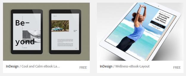
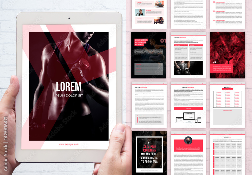
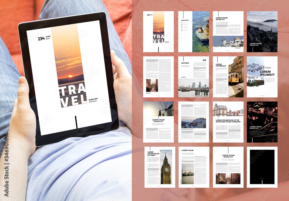
Using High-Quality Images and Graphics
When it comes to ebook cover design, the selection of high-quality images and graphics is of utmost importance. These visuals not only have the power to capture the reader's attention but also play a significant role in conveying the brand's message and identity.
Image Selection Importance
Ensuring the use of high-quality images and graphics is essential for enhancing the overall impact of ebook cover designs. When it comes to selecting images for your ebook cover, it's important to consider the following tips:
- Choose images that are relevant to the content of your ebook. This will help create a connection between the cover and the story inside.
- Opt for visually appealing images that grab the attention of potential readers. A stunning visual can entice them to explore your book further.
- Consider the mood and tone of your ebook. The images you select should reflect the emotions and themes of your story.
- Pay attention to the composition and balance of the images. A well-structured design can create a sense of harmony and professionalism.
Graphic Impact on Branding
Using high-quality images and graphics is crucial for maximizing the graphic impact and strengthening the branding elements in ebook cover design. The impact of branding on consumer perception cannot be underestimated.
A well-designed ebook cover with high-quality visuals can attract and engage potential readers, leaving a lasting impression of professionalism and quality. By incorporating consistent visual elements, such as colors, fonts, and imagery, throughout your ebook covers, you create a sense of visual consistency in branding.
This consistency not only helps in building brand recognition but also creates a cohesive and unified look across all your ebook covers, strengthening the overall branding strategy. Visual consistency is important as it helps in creating a strong and memorable brand identity, making your ebooks instantly recognizable to your target audience.
High-Quality Visuals Enhance
Incorporating high-quality images and graphics into your ebook cover design enhances the visual appeal and overall quality of your branding efforts. The use of captivating visuals can immediately grab the attention of potential readers and draw them in. High-quality images and graphics can convey a sense of professionalism and attention to detail, making your ebook cover stand out from the competition.

Visual storytelling: By using high-quality visuals, you can tell a story and create a visual narrative that resonates with your target audience. This can help to establish a deeper connection and engagement with your branding efforts.
Brand recognition: High-quality visuals can help to create a strong and memorable brand identity. When readers see your ebook cover, they should be able to instantly recognize and associate it with your brand. This can help to build trust and loyalty among your audience.
Eye-catching design: High-quality images and graphics can make your ebook cover design visually stunning and eye-catching. This can grab the attention of potential readers and make them curious to explore your ebook further.
Professionalism: Using high-quality visuals demonstrates a level of professionalism and attention to detail, which can enhance the perceived value and quality of your ebook. This can help to attract more readers and increase the likelihood of them choosing your ebook over others.
Optimizing ebook cover designs for various platforms and devices enhances the overall reading experience for users. Designing for different ebook formats and optimizing for mobile devices ensures that readers can access and enjoy your ebook no matter what device they are using.
With the increasing popularity of smartphones and tablets, it is crucial to consider the different screen sizes and resolutions when creating ebook covers. By adapting your design to fit these various platforms, you can ensure that your branding is displayed effectively and that your cover looks visually appealing on any device.
Additionally, designing for different ebook formats allows your ebook to be accessible on a wide range of platforms, expanding your potential audience and increasing the reach of your brand.
Adding Intriguing Taglines or Catchphrases
Incorporating the author's vision and a coordinating conjunction, a compelling tagline or catchphrase can greatly enhance the impact of an ebook cover design. These short phrases have the power to captivate readers and create an emotional connection to the story within.
Here are four ways to make taglines or catchphrases intriguing and unforgettable:
Keep it concise and memorable: A short and snappy phrase is more likely to stick in the reader's mind.
Use vivid language: Choose words that evoke powerful imagery and create a sense of curiosity.
Align with the story: Ensure that the tagline or catchphrase accurately represents the essence of the book, enticing readers to explore further.
Experiment with typography: Enhance the visual storytelling aspect by playing with different fonts, sizes, and styles to make the tagline or catchphrase visually appealing.
Implementing Effective Layout and Composition Techniques
The layout and composition of an ebook cover design play a crucial role in capturing the attention of potential readers and conveying the brand message effectively.
To create a visually appealing cover that stands out, designers can employ various layout techniques. One such technique is the rule of thirds, which involves dividing the cover into nine equal parts and strategically placing important elements along the intersecting lines.
Another effective layout technique is the use of visual hierarchy, where elements are arranged in a way that guides the viewer's eye towards the most important information.
In terms of composition techniques, designers can use symmetry or asymmetry to create balance and visual interest. Symmetry creates a sense of harmony and order, while asymmetry adds a dynamic and unexpected element.
Conducting A/B Testing and Iterating for Optimal Results
Effectively conducting A/B testing and iterating is essential for achieving optimal results in ebook cover design. It allows designers to gather valuable insights and make data-driven decisions to improve their designs.
Here are four key steps to conducting A/B testing and iterating for optimal results:
Conducting user research: Before starting the A/B testing process, it is crucial to understand the target audience's preferences and expectations. This can be done through surveys, focus groups, or interviews to gather valuable insights.
Defining metrics and goals: Clearly defining the metrics and goals of the A/B testing will help in analyzing the data effectively. Whether it's click-through rates, conversion rates, or user engagement, having specific goals will provide clarity and direction.
Creating variations: Designers should create multiple variations of the ebook cover design, making specific changes to test different elements such as colors, typography, or imagery. This will allow for a more comprehensive analysis of what resonates best with the target audience.
Analyzing data: Once the A/B testing is completed, it is essential to analyze the data collected. This involves comparing the performance of different variations and identifying patterns or trends to determine which design elements are more effective in achieving the desired goals.
Frequently Asked Questions
How Can I Choose the Right Colors and Typography for My Ebook Cover Design?
When choosing the right colors and typography for your ebook cover design, consider the importance and impact they have on your brand. Creative and informative choices can persuade and attract your desired audience, giving them a sense of freedom.
What Are Some Tips for Creating a Consistent Visual Theme Throughout My Ebook Cover Designs?
Creating a consistent visual theme throughout ebook cover designs involves careful font selection and the creation of a unique visual style. It is essential to avoid choosing the wrong font and to ensure that all elements contribute to a cohesive and visually appealing design.
Should I Incorporate My Author's Logo or Branding Elements Into My Ebook Cover Design?
Incorporating branding elements, such as the author's logo, into ebook cover design is a personal choice that depends on the overall branding strategy. It can enhance brand recognition and contribute to a cohesive brand image.
How Can I Ensure That the Images and Graphics Used in My Ebook Cover Design Are of High Quality?
To ensure high-quality images and graphics in ebook cover design, it is crucial to choose visually appealing designs, incorporate branding elements effectively, and create a cohesive visual theme. Additionally, selecting appropriate colors, typography, and incorporating the author's logo are essential for a successful design.
When designing ebook covers for different platforms and devices, it is important to consider factors such as screen size, resolution, and readability. Best practices for ebook cover design include using eye-catching visuals, legible fonts, and consistent branding elements.

 Digital Art InstructionDIY Infographics DesignMobile Game ArtworkPersonalized Logo Design3D AnimationeBook Covers DesignPrivacy PolicyTerms And Conditions