In the world of blogging, a well-designed logo is an essential component for establishing a strong brand identity. It serves as a visual representation of your blog's unique personality and values.
To help bloggers navigate the intricacies of logo design, this article explores ten golden principles that every blogger should know.
From understanding the basics to choosing the right colors and typography, to creating a memorable logo icon, this guide offers valuable insights for crafting a logo that resonates with your audience and stands the test of time.
Importance of a Well-Designed Logo for Bloggers
One cannot underestimate the significance of a well-designed logo for bloggers. A professional logo design offers numerous benefits for bloggers, starting with enhancing brand recognition.
A well-designed logo acts as the face of a blog, instantly capturing the attention of readers and creating a memorable impression. It helps establish a strong brand identity, making it easier for bloggers to stand out in a crowded market.
A professional logo design also helps build credibility and trust, as it portrays a sense of professionalism and dedication to quality. It can leave a lasting impression on readers, increasing the likelihood of them returning to the blog for more content.
In addition, a well-designed logo can be easily recognized across various platforms, including social media, creating a cohesive brand presence and expanding the blog's reach.

Understanding the Basics of Logo Design
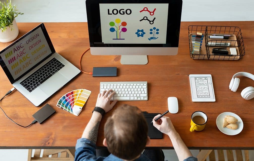
Two key elements to consider when understanding the basics of logo design are simplicity and versatility. A logo should be simple enough to be easily recognizable and memorable, while also being versatile enough to be used across different platforms and mediums.
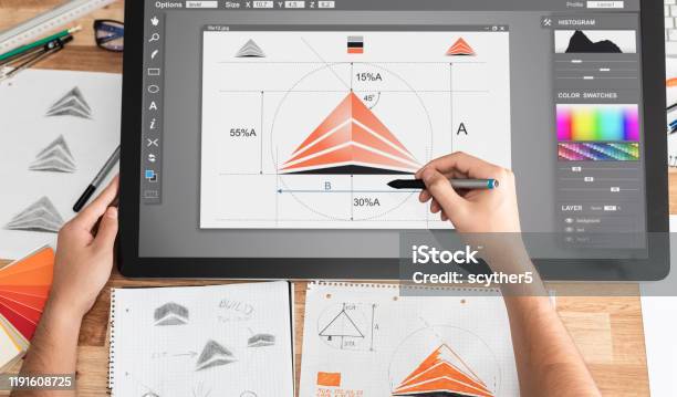
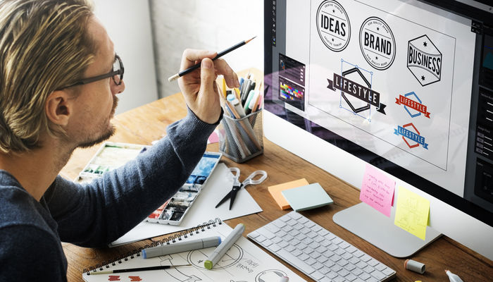
Understanding logo elements is crucial in creating a design that effectively represents a blogger's brand or identity. The logo design process involves brainstorming ideas, sketching concepts, and refining the chosen design through iterations.
It is important to consider factors such as color, typography, and symbolism when creating a logo.
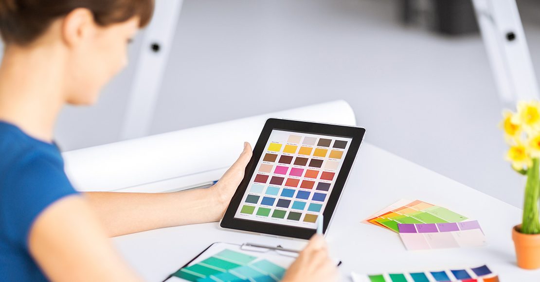
Choosing the Right Colors for Your Blog Logo
When it comes to designing a logo for your blog, choosing the right colors is crucial. Color psychology plays a significant role in how people perceive and connect with your brand.
Additionally, maintaining brand consistency with colors across your blog and other platforms helps establish a strong visual identity.
The impact of color choices on your blog logo can make a lasting impression on your audience and contribute to the overall success of your brand.
Color Psychology for Logos
As a blogger, you have the opportunity to harness the power of color psychology when choosing the right colors for your blog logo. Color symbolism plays a significant role in how people perceive and connect with brands. Each color has its own psychological associations and can evoke different emotions and meanings.
For example, blue is often associated with trust and reliability, while red can convey passion and excitement. The impact of color on brand perception cannot be underestimated. It can influence how your audience perceives your blog and the messages you want to convey.
When selecting colors for your blog logo, consider the emotions and values you want to evoke in your audience. Choose colors that align with your blog's identity and purpose to create a logo that captures attention and resonates with your readers.
Brand Consistency With Colors
To ensure brand consistency, it is essential to carefully select and coordinate the right colors for your blog logo. The colors you choose will not only evoke certain emotions but also play a crucial role in brand recognition.
Here are three important points to consider when choosing the colors for your blog logo:
Understand color psychology: Different colors have different meanings and can evoke different emotions. For example, blue is often associated with trust and reliability, while red conveys energy and urgency. Understanding color psychology can help you choose colors that align with your blog's message and target audience.
Create a color palette: Once you have a clear understanding of color psychology, create a color palette that includes primary and secondary colors for your blog logo. This palette will serve as a guide for all your branding materials, ensuring consistency across different platforms.
Test and iterate: Don't be afraid to experiment with different color combinations. Test your logo in various contexts and gather feedback from your audience. Use this feedback to iterate and refine your color choices until you achieve a logo that represents your blog's personality and resonates with your readers.
Impact of Color Choices
The color choices you make for your blog logo can have a significant impact on its overall effectiveness and the perception of your brand. Colors have the power to evoke emotions and convey messages without the need for words.
Understanding color symbolism and how it relates to your brand is crucial in choosing the right colors for your blog logo. Different colors have different meanings and associations, so it's important to select colors that align with the values and personality of your brand.
Additionally, creating a cohesive color palette for your blog logo can enhance brand recognition and consistency across all your branding materials. Consider the psychology behind colors and use them strategically to create a logo that not only looks visually appealing but also resonates with your target audience.
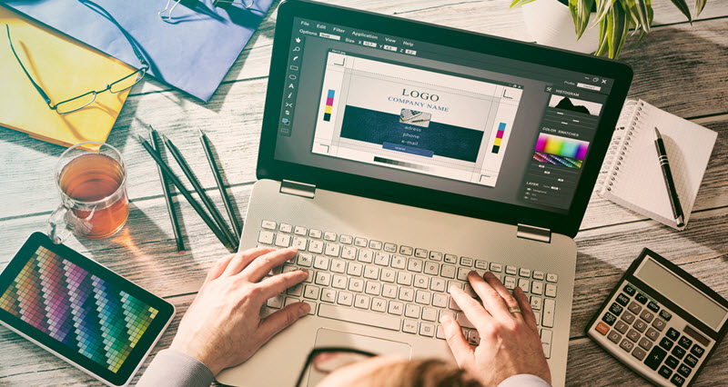
Typography: Finding the Perfect Font for Your Logo
When it comes to logo design for blogs, choosing the right font is essential. The font style you select can have a significant impact on how your logo is perceived by your audience. Typography plays a crucial role in creating brand identity, conveying the message of your blog, and evoking certain emotions.
Additionally, ensuring readability and legibility of the font is crucial to ensure that your logo is easily understood and recognizable.
Font Style Impact
Selecting the right font style is a crucial aspect of logo design as it significantly influences the overall impact and perception of the brand. The font style chosen for a logo can convey a variety of emotions and messages, and it is important to select one that aligns with the brand's values and personality.
Here are three font pairing techniques that can help create a visually appealing and impactful logo:
Contrast: Combining fonts that have contrasting styles, such as pairing a bold, sans-serif font with a delicate script font, can create a dynamic and eye-catching logo.
Consistency: Using fonts from the same font family or with similar characteristics can create a cohesive and harmonious logo design.
Hierarchy: Playing with font sizes, weights, and styles can help establish a visual hierarchy within the logo, guiding the viewer's attention and emphasizing key elements.
Brand Identity Through Typography
As bloggers aim to establish a strong brand identity, they can achieve this through typography by finding the perfect font for their logo. Typography trends play a crucial role in creating a visually appealing and memorable logo that reflects the blogger's unique style and personality.
Choosing the right font can make a significant impact on the overall brand identity as it sets the tone and communicates the blogger's message effectively.
Font pairing is another essential aspect to consider, as it involves combining different fonts that complement each other and create a harmonious visual experience.
Readability and Legibility
Ensuring the readability and legibility of your logo's typography is crucial for conveying your brand's message clearly and effectively. When it comes to choosing the perfect font for your logo, there are a few readability techniques you should keep in mind:
Contrast: Opt for a font that has a clear contrast between the letters and the background. This will make the text easier to read, especially from a distance.
Spacing: Pay attention to the spacing between letters and words. Too much or too little space can affect legibility. Aim for a balanced and harmonious arrangement.
Simplicity: Choose a font that is simple and clean. Avoid overly decorative or complex fonts that can be difficult to read.
The importance of legibility cannot be overstated. A logo that is easy to read will help your audience quickly understand your brand and its message, creating a memorable and impactful impression.
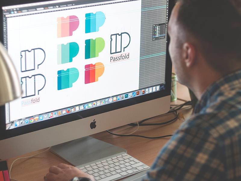
Creating a Unique and Memorable Logo Icon
One essential step in crafting a distinctive and unforgettable logo icon is to carefully consider the use of color. Color is a powerful tool that can evoke emotions and convey messages. When designing a logo, it is important to choose colors that align with the brand's identity and values.
Incorporating symbolism in logo design is another effective way to create a unique and memorable logo icon. Symbols can add depth and meaning to a logo, making it more memorable and visually appealing.
Additionally, utilizing negative space creatively can make a logo stand out. Negative space refers to the empty space around and between design elements. By using negative space cleverly, designers can create hidden shapes or messages within the logo, adding an element of surprise and intrigue.
When combined, these techniques can help create a logo icon that is truly unforgettable.
Balancing Simplicity and Complexity in Logo Design
How can designers effectively balance simplicity and complexity in logo design? It's a delicate dance between creating a logo that is visually appealing and easy to understand, while also incorporating depth and meaning. Here are three tips to strike the perfect balance:
Finding inspiration: Look to nature, art, or even everyday objects for ideas. Draw inspiration from the world around you to infuse your logo with a touch of the familiar and relatable.
Incorporating symbolism: Symbolism can add layers of meaning to your logo. Consider using abstract shapes or incorporating elements that represent your brand's values or mission.
Simplicity in complexity: Simplicity doesn't mean being plain or boring. Instead, it means distilling complex ideas into their simplest form. Focus on the core essence of your brand and translate it into a clean and memorable logo design.
The Power of Negative Space in Logo Design
Utilizing negative space in logo design can create a sense of intrigue and captivate the viewer's attention. It is a powerful technique that allows designers to convey multiple meanings and messages through clever use of empty spaces.
The art of minimalism is at the core of this approach, as it focuses on stripping away unnecessary elements and leaving only the essential. By using negative space, designers can create hidden messages in logos, adding an extra layer of depth and meaning to their designs.

This technique not only adds visual interest but also engages the viewer in a thoughtful exploration of the logo. The power of negative space lies in its ability to spark curiosity and leave a lasting impression, making it an essential tool in logo design.
Effectively designing a logo for different sizes and platforms requires careful consideration of scalability and a comprehensive understanding of the brand's visual identity. When designing a logo that can be used across various platforms and accommodate different screen sizes, keep these key principles in mind:
Simplify: Create a logo that is clean and easily recognizable, even when scaled down to smaller sizes. Avoid intricate details that may get lost or become illegible.
Optimize: Optimize the logo for digital platforms by using vector graphics, which can be easily resized without losing quality. This ensures that the logo looks crisp and clear on any screen size.
Responsiveness: Design a logo that adapts to different platforms, such as websites, social media profiles, and mobile apps. Consider how the logo will appear on different backgrounds and in different contexts.
Ensuring Logo Versatility and Adaptability
To achieve maximum flexibility and seamless integration, it is important for bloggers to create a logo that is versatile and adaptable across various platforms.
Logo adaptability refers to the ability of a logo to maintain its visual appeal and effectiveness regardless of the medium or size it is displayed in. Whether it is on a website, social media profile, or printed materials, a logo should be easily recognizable and retain its impact.
Logo versatility, on the other hand, refers to the logo's ability to be used in different contexts and still convey the intended message and brand identity. This includes variations of the logo for different purposes, such as a simplified version for small sizes or a monochrome version for black and white printing.
Testing and Refining Your Blog Logo Design
When it comes to testing and refining your blog logo design, there are three key points to consider.
First, simplifying the design can make it more memorable and easily recognizable.
Second, experimenting with different color schemes can help you find the perfect combination that resonates with your target audience.
Simplifying Design for Memorability
Refining the design of your blog logo through testing and simplification is essential for creating a memorable brand image. Simplifying design is not about removing elements, but rather streamlining them to enhance the logo's visual impact.
Here's how you can simplify your blog logo design:
Minimalism: Embrace simplicity by using clean lines, minimal colors, and uncluttered compositions. This allows your logo to make a lasting impression with its simplicity and elegance.

Typography: Choose a simple, legible font that reflects your blog's personality. Experiment with different font weights and sizes to find the perfect balance between readability and visual impact.
Iconography: Incorporate a simple and memorable icon that represents your blog's niche or core message. This can be achieved through abstract shapes, symbols, or even a stylized version of your blog's initials.
Experimenting With Color Schemes
Through experimenting with different color schemes, bloggers can test and optimize their blog logo design to create a visually appealing and impactful brand image.
Exploring color palettes allows bloggers to find the perfect combination that represents their blog's personality and resonates with their target audience.
By incorporating gradients, bloggers can add depth and dimension to their logo design, making it more visually engaging and memorable. Gradients create a smooth transition between colors, allowing bloggers to experiment with different shades and intensities.
This experimentation process is essential for refining the blog logo design, as it helps bloggers understand which color schemes evoke the desired emotions and convey the intended message.
Seeking Feedback for Improvement
Gathering input from others is crucial in order to fine-tune and enhance the design of your blog logo. Seeking feedback allows you to gain valuable insights and perspectives that can help you improve logo visibility and incorporate brand values.
Here are three ways you can seek feedback to refine your blog logo design:
Conduct surveys or polls: Create a questionnaire or poll and ask your audience for their thoughts on your logo. This will provide you with quantitative data to assess the overall appeal and effectiveness of your design.
Reach out to fellow bloggers: Connect with other bloggers in your niche and ask for their feedback on your logo. They can offer valuable insights and suggestions based on their own experiences and expertise.
Utilize social media platforms: Share your logo design on social media and ask your followers for their feedback. This allows you to tap into a larger audience and gather diverse opinions.
Frequently Asked Questions
What Software or Tools Can I Use to Design My Blog Logo?
When designing a unique and eye-catching logo for your blog, it is important to explore different logo design software options for beginners. These tools can assist in creating visually appealing logos that resonate with your audience.
How Much Should I Expect to Pay for a Professional Logo Design?
The cost of a professional logo design can vary depending on factors such as the complexity of the design, the experience of the designer, and the market demand. It is crucial for a blog to have a unique and memorable logo to stand out from the competition.
Can I Use Stock Images or Clip Art in My Blog Logo?
Using stock images or clip art in a blog logo can hinder uniqueness and originality. It is recommended to find a professional logo designer or use online logo design tools to create a visually appealing and unique logo for your blog.

Should My Logo Incorporate Elements Related to My Blog's Niche or Topic?
When designing a logo for a blog, it is crucial to consider incorporating elements related to the blog's niche or topic. This helps convey the blog's message and captures the attention of the target audience. Additionally, the use of color psychology and appropriate typography further enhances the impact of the logo.
How Do I Protect My Blog Logo From Being Copied or Used Without Permission?
To protect your blog logo from being copied or used without permission, it is important to take legal steps such as copyrighting and trademarking. These considerations ensure the protection of your logo and its unique identity.
 Digital Art InstructionDIY Infographics DesignMobile Game ArtworkPersonalized Logo Design3D AnimationeBook Covers DesignPrivacy PolicyTerms And Conditions