
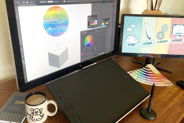
In today's highly competitive e-commerce landscape, a captivating logo is essential for a brand's success.
To help you stay ahead of the curve, we have compiled a list of the top 10 trending ideas for showstopping e-commerce logo design.
From minimalist designs to bold typography and symbolic icons, this article will inspire and guide you in creating a logo that grabs attention and leaves a lasting impression.
Don't miss out on these innovative ideas that will set your brand apart from the rest.
Minimalist Designs
One of the most popular design trends in e-commerce logo design is the use of minimalist designs. Minimalism has taken the world by storm, offering a clean, sleek, and modern approach to branding. This minimalist branding not only creates a visually appealing logo but also enhances the overall user experience.
By using simple shapes, clean lines, and a limited color palette, minimalist logos make a bold statement without overwhelming the viewer. In addition to logo design, minimalist website design has also gained significant traction in the e-commerce industry. These websites embrace simplicity, focusing on clear navigation, ample white space, and minimal distractions.
The minimalist approach allows for a seamless and intuitive browsing experience, ultimately leading to increased conversion rates and customer satisfaction. So, if you're looking to create a timeless and impactful e-commerce logo, consider incorporating minimalist design elements to make a lasting impression.
Geometric Shapes
How can the use of geometric shapes in e-commerce logo design create a visually striking and memorable brand identity?
Geometric patterns and abstract shapes have become increasingly popular in the world of logo design, and for good reason. These shapes have a unique ability to capture attention and create a sense of modernity and sophistication.
By incorporating geometric shapes into an e-commerce logo, brands can convey a sense of structure, precision, and creativity. The clean lines and symmetrical forms of geometric shapes create a visually appealing aesthetic that is both timeless and versatile.
Whether it's a circle, square, triangle, or hexagon, these shapes can be used to represent various elements of a brand, such as unity, stability, growth, or innovation. When used effectively, geometric shapes can help e-commerce businesses stand out in a crowded market and leave a lasting impression on customers.
Bold Typography
Bold typography, along with its commanding presence, can instantly capture the attention of viewers and make a strong statement for an e-commerce logo design. In the world of online shopping, where competition is fierce, a bold and eye-catching logo can be the key to standing out from the crowd.
Minimalist designs are currently on-trend, and bold typography fits perfectly into this aesthetic. By using strong and impactful fonts, e-commerce brands can convey a sense of confidence and authority.
Bold typography allows for clear and easy readability, ensuring that the message of the logo is effectively communicated to the audience. Whether it's a sleek and modern sans-serif font or a bold and elegant serif typeface, the use of bold typography can add a level of sophistication and professionalism to any e-commerce logo design.
Abstract Elements
Abstract shapes and forms can add a touch of creativity and uniqueness to e-commerce logo designs, allowing brands to convey their identity in a visually intriguing and memorable way. By incorporating abstract elements into their logos, businesses can capture the attention of their audience and stand out from the competition.
Here are three reasons why abstract shapes and unique patterns are trending in e-commerce logo design:
Visual Impact: Abstract shapes have the power to create an immediate visual impact, grabbing the viewer's attention and leaving a lasting impression. They can evoke emotions and convey the brand's message in a subtle yet powerful way.
Versatility: Abstract elements offer endless possibilities for customization and adaptation. They can be combined with other design elements to create a cohesive brand image that can be used across various platforms and marketing materials.
Symbolic Representation: Abstract shapes often have symbolic meanings that can represent the values and characteristics of a brand. They can communicate concepts such as growth, innovation, and connectivity, allowing the logo to tell a story and resonate with the target audience.
Incorporating abstract shapes and unique patterns into e-commerce logo designs can elevate the brand's visual identity and create a memorable impression in the minds of customers.
Vintage and Retro Styles
Vintage and retro styles have made a strong comeback in the world of e-commerce logo design, offering a nostalgic appeal that resonates with consumers. These styles allow businesses to revive old design trends and infuse them with a modern twist, creating a unique and memorable brand identity.

Nostalgic Appeal in Logos
Evoke a sense of nostalgia and captivate your audience with logo designs that incorporate vintage and retro elements. Nostalgia in branding is a powerful tool that creates an emotional connection with customers and allows them to reminisce about the past. By incorporating vintage and retro styles in your logo, you can tap into the longing for simpler times, evoking feelings of comfort, familiarity, and freedom.
Here are three ways to incorporate nostalgic appeal in your e-commerce logo design:
Retro Typography: Use fonts that were popular in the past to create a vintage feel. Think bold and decorative lettering that harkens back to the 1950s or 1960s.
Vintage Color Palette: Choose colors that were commonly used in the era you want to evoke. Pastel shades, muted tones, and earthy hues can all add a touch of nostalgia to your logo.
Iconic Imagery: Incorporate iconic symbols or images from the past that are synonymous with a particular era. This can include retro technology, vintage fashion, or classic design elements.
Reviving Old Design Trends
Embracing classic aesthetics while incorporating modern elements can breathe new life into old design trends, giving your e-commerce logo a fresh and timeless appeal.
In today's fast-paced digital world, reviving old design trends like vintage and retro styles can create a sense of nostalgia and authenticity that resonates with customers.
By using hand-drawn illustrations, you can add a touch of uniqueness to your logo, capturing the essence of a bygone era while still maintaining a contemporary feel. Hand-drawn illustrations bring a sense of artistry and craftsmanship to your logo, making it stand out from the crowd.
Whether it's a vintage typewriter or a retro cassette tape, incorporating these elements into your logo design can evoke a sense of nostalgia and create a lasting impression on your audience.
Modernizing Vintage Aesthetics
The resurgence of vintage and retro styles in e-commerce logo design has become a prominent trend in the industry. Modernizing vintage aesthetics allows businesses to tap into the nostalgic appeal that these styles evoke while giving them a contemporary twist.
Here are three ways to modernize vintage aesthetics and create showstopping e-commerce logos:
Minimalistic Approach: By simplifying intricate vintage designs and focusing on clean lines and typography, you can create a modern logo that still retains a hint of retro charm.
Color Palette Update: Experimenting with bold and vibrant color combinations can breathe new life into vintage aesthetics, making them more appealing to a modern audience.
Playful Typography: Combining vintage-inspired fonts with modern typography techniques can create a unique visual language that captures the essence of both old and new.

Monogram and Lettermark Logos
Frequently utilized in branding, monogram and lettermark logos offer a sleek and minimalist approach to representing e-commerce businesses. These designs focus on the initials or the first letter of the brand name, creating a strong and memorable visual identity.
Monogram logos combine two or more letters, often intertwined or overlapping, to form a unique symbol. This type of design is perfect for e-commerce companies looking to establish a sophisticated and timeless brand image.
On the other hand, lettermark logos use only the initials, showcasing simplicity and elegance. Using monogram or letter mark designs, e-commerce businesses can concisely and visually appealingly convey their brand essence.
These minimalistic logos are perfect for modern consumers who value simplicity and freedom of choice.
Gradient and Colorful Logos
Vibrant and eye-catching, gradient and colorful logos are a popular choice for e-commerce businesses looking to create a visually striking and memorable brand identity. These logos make use of multiple colors blended together seamlessly, creating a sense of depth and dimension.
Here's why gradient and colorful logos are a great choice for your e-commerce brand:
Emotional Impact: Colors have a powerful effect on human emotions. By using a vibrant gradient or a combination of bold and bright colors, you can evoke specific emotions that align with your brand's message and values.

Brand Recognition: A colorful logo stands out and grabs attention, making it more likely to be remembered by potential customers. When done right, a gradient logo can become synonymous with your brand, instantly recognizable and memorable.
Versatility: Gradient and colorful logos offer endless possibilities for creative expression. They can be adapted to different marketing materials, social media platforms, and packaging designs, maintaining a consistent brand image across various touchpoints.
Symbolic and Iconic Logos
As the saying goes, a picture is worth a thousand words. When it comes to logo design, this couldn't be more true. Symbolic and iconic logos have the power to convey a message or evoke an emotion with just a simple image.
In this discussion, we will explore the art of effective logo symbolism, the impact of iconic logos, and the distinction between symbolic and iconic designs.
Get ready to unlock the visual power of your brand!
Effective Logo Symbolism
A well-designed logo symbolizes the essence of a brand and effectively communicates its message to the target audience. In the world of e-commerce, where competition is fierce, a logo must captivate and engage customers. To achieve this, logo designers often incorporate symbolism that resonates with the audience.
Here are three examples of effective logo symbolism:
Logo Psychology: Logos can tap into the psychology of consumers by utilizing colors, shapes, and imagery that evoke specific emotions. For example, a logo with warm colors like red and orange may convey excitement and passion, while a logo with cool colors like blue and green may evoke a sense of trust and calmness.
Cultural References: By incorporating cultural references, logos can connect with specific target markets. This can be achieved through the use of symbols, patterns, or motifs that are associated with a particular culture or tradition. By doing so, a logo can create a sense of familiarity and relatability among its target audience.
Iconic Imagery: Some logos become iconic by using simple, recognizable symbols that are instantly associated with a brand. Think of the Nike swoosh or the Apple logo. These symbols have become ingrained in popular culture and are instantly recognizable, making them highly effective in conveying a brand's message.
Impact of Iconic Logos
The influence of iconic logos on brand recognition and consumer perception cannot be overstated. Iconic logos have the power to shape a brand's identity and create a lasting impact on its target audience.
In today's fast-paced digital world, where attention spans are short and competition is fierce, the impact of minimalism in logo design has become increasingly important. Brands are now embracing simplicity and clean lines to create logos that are instantly recognizable and memorable.
This evolution of logo design reflects the changing preferences of consumers, who are drawn to logos that are visually appealing and convey a sense of trust and professionalism.
Symbolic Vs Iconic
Two distinct approaches to logo design, symbolic and iconic logos, offer different strategies for creating a strong brand identity.

While symbolic logos rely on abstract or representational imagery to convey meaning, iconic logos use recognizable symbols or figures that are easily identifiable.
When choosing between these two design styles, it is important to consider the message and values you want to communicate to your audience.
Here are three key differences between symbolic and iconic logos:
Symbolic representation: Symbolic logos often use abstract shapes, colors, and patterns to convey deeper meanings and evoke emotions. They allow for more creative interpretation and can be a powerful tool in expressing complex ideas.
Iconic representation: Iconic logos rely on familiar symbols or figures that are easily recognizable and associated with specific meanings. They offer a straightforward and direct approach to communicating your brand's message.
Brand recognition: Symbolic logos may require more effort and time for your audience to associate them with your brand, while iconic logos have the advantage of immediate recognition and recall value.
Ultimately, the choice between symbolic and iconic logos depends on your brand's unique identity, target audience, and the message you want to convey.
Hand-drawn Illustrations
While hand-drawn illustrations may seem unconventional, they have become a popular choice in creating unique and captivating e-commerce logos. In a world dominated by digital designs, the charm and authenticity of hand-drawn illustrations bring a nostalgic appeal to logos, making them stand out in a sea of cookie-cutter designs.
These illustrations have the power to evoke emotions and create a personal connection with the audience, tapping into their desire for freedom and individuality. Hand-drawn logos have a raw and organic quality that resonates with customers who are seeking a break from the mass-produced and impersonal.
They add a touch of personality and charm to the brand, making it more relatable and memorable. So, if you want your e-commerce logo to leave a lasting impression, consider incorporating hand-drawn illustrations to create a one-of-a-kind design.
Negative Space Logos
Negative space logos, often incorporating clever visual illusions, are a popular choice among designers looking to create impactful and memorable e-commerce logos. These innovative logo concepts utilize the space around and within the design to convey multiple meanings and messages, making them visually intriguing and intellectually stimulating.
Here are three reasons why negative space logos are gaining popularity in the world of e-commerce:
Memorable and Unique: Negative space logos stand out from the crowd, leaving a lasting impression on viewers. By using the hidden or empty space within the design, these logos create a sense of intrigue and curiosity, making them memorable and unique.
Versatile and Adaptive: Negative space logos have the advantage of being versatile and adaptable to different mediums and sizes. Whether it's on a website, mobile app, or packaging, these logos can be scaled and adjusted without losing their impact or legibility.
Symbolic and Meaningful: Negative space logos often incorporate clever visual illusions that convey deeper meanings and messages. By using the negative space strategically, designers can create symbols and imagery that represent the values and essence of the brand, adding depth and symbolism to the logo.
Frequently Asked Questions
How Can I Incorporate Negative Space Into My E-Commerce Logo Design?
Incorporating negative space in e-commerce logo design allows for a minimalist and visually appealing approach. By strategically using empty spaces, you can create a clever and memorable logo that captures attention and conveys your brand's message effectively.
What Are Some Popular Hand-Drawn Illustration Styles That Work Well for E-Commerce Logos?
Organic illustration styles and minimalist hand-drawn illustrations are popular choices for e-commerce logos. These styles offer a sense of authenticity and creativity, capturing the attention of an audience that desires freedom and uniqueness in their shopping experiences.
Can You Provide Examples of Symbolic and Iconic E-Commerce Logos?
Symbolic and iconic e-commerce logos are essential for creating a strong brand identity. Examples include the Nike swoosh, Apple's bitten apple, and McDonald's golden arches. These logos evoke an immediate recognition and convey the company's values and mission.
What Are Some Tips for Creating a Gradient and Colorful E-Commerce Logo That Stands Out?
When creating a gradient and colorful e-commerce logo, it is important to consider the use of gradients and color psychology to evoke positive emotions and attract customers. Simplicity and minimalism are also vital to ensure a visually appealing and memorable design.
Are There Any Specific Fonts or Typography Styles That Are Recommended for Bold Typography E-Commerce Logos?
When designing bold typography e-commerce logos, it is important to choose the right typography that conveys the brand's message effectively. Recommended font pairings can enhance the visual impact and make the logo stand out.
 Digital Art InstructionDIY Infographics DesignMobile Game ArtworkPersonalized Logo Design3D AnimationeBook Covers DesignPrivacy PolicyTerms And Conditions